CRC Associates
CRC Associates is a small company specializing in providing products and services to the Medical and Research community.

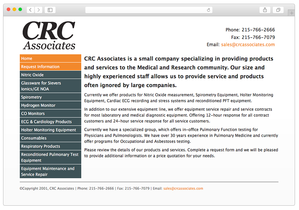
I've been doing web updates for CRC Associates for a few years, but every time we approach the subject of a redesign it always falls through. Their current site is as simple as one can be. It is a static text heavy website. I wanted to bring in some more colorful elements while still looking professional. The next time we talk about redesigning their website I will be able to show them these changes.
Current Site

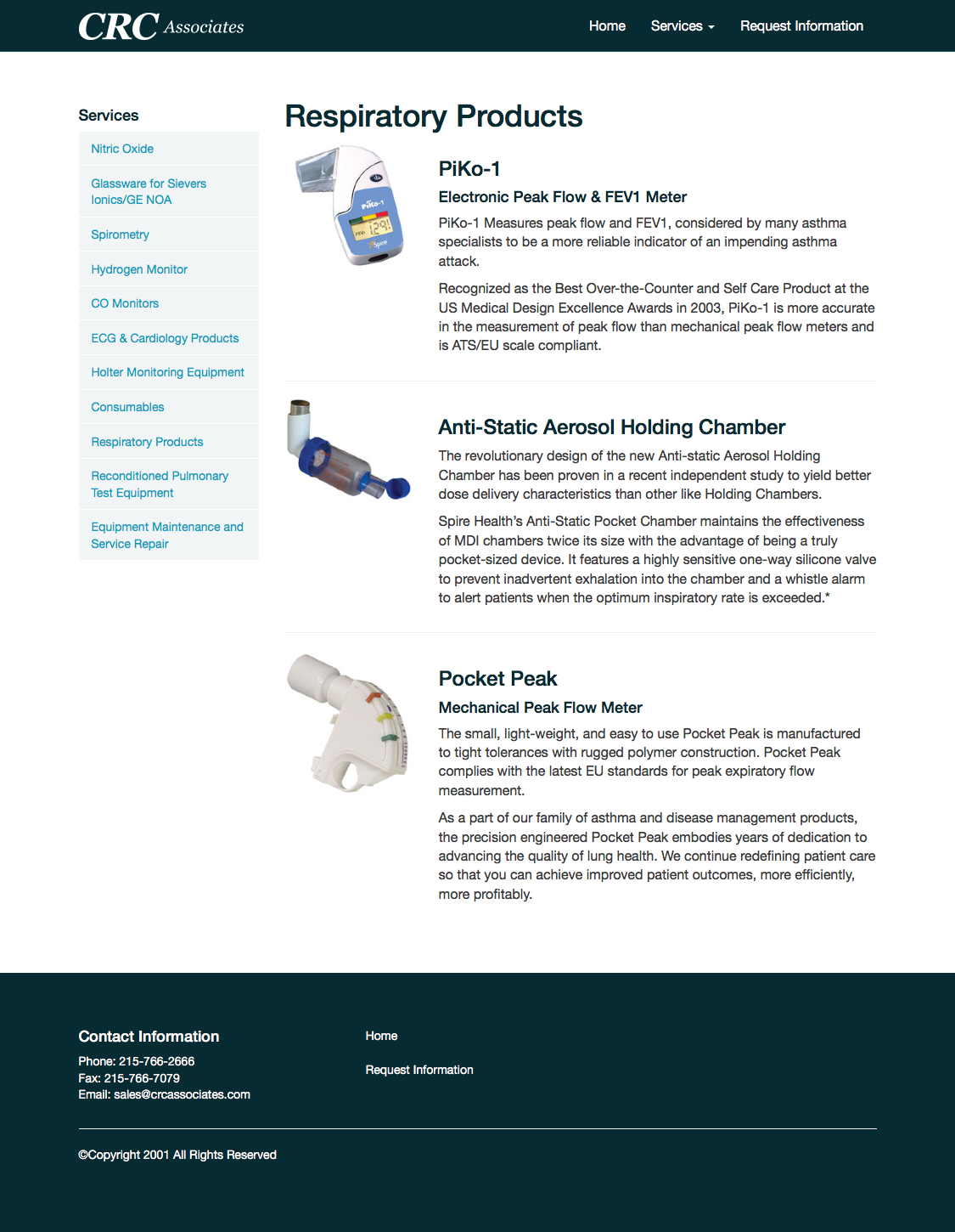
Starting with a style guide to get the colors, fonts and feel of the website has was really useful. I kept inline with their orange and blue/gray color scheme and expanded it out. I also cleaned up the type and table styles and updated their logo into a horizontal version. Navigation was changed from a left side nav to a main navigation bar with drop down for services. On internal pages the Services left nav continues to make it easier for navigating.
Style Guide

The blues and gray main color scheme with orange highlights kept this design looking professional while the bigger type, large image and use of icons brought it up to the next level. This design was built both in photoshop and in the browser within a responsive framework. Additional icons for suited for the medical industry were used where no photography was currently being used.
Site Design


